How to Enhance Your Web User Experience

As the world of web design and development continues to grow and evolve, it’s vital for website owners to keep up with new techniques. That’s where user experience comes in. User experience can make or break your website, creating a positive or negative experience for your audience. When creating a website, it’s important to remember that not every article of clothing fits every body type. That said, here are quick tips to help you improve the user experience on your website.
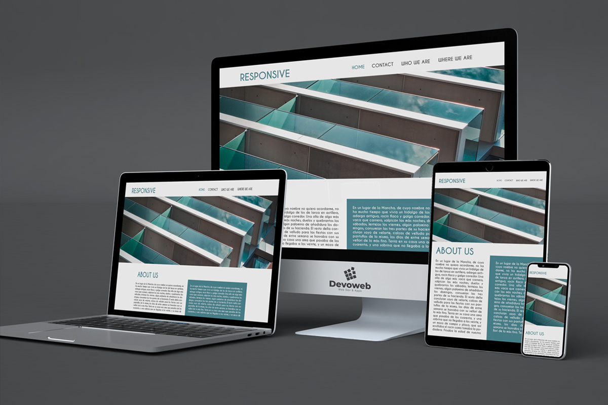
Make your website responsive.
A website that’s not responsive will certainly disappoint users who have a laptop, desktop, tablet, or smartphone. In addition to this, it will be necessary to make sure the images and content are not only accessible on every device but are also optimized for it. On the other hand, properly implemented minimalism can create a clean and efficient experience right down to the smallest of details. Another benefit of creating a responsive site is that it is mobile-friendly. Mobile usage continues to increase at an alarming rate, while desktop use continues to decline year over year. Statistics are showing that mobile traffic will soon surpass desktop traffic, meaning the responsive design is crucial to staying competitive.
Bring the elements closer together.
When you’re designing your website, make sure to put everything where users would expect to find it. Studies have shown that people tend to scan rather than read, which means that if you want your audience to engage in more than just a cursory glance at your content, be sure they can get what they need quickly and easily. For example, put navigation buttons close to the top of your website; above the fold, so users can see them without scrolling. Put calls to action where people will notice them. Make sure that your content is easy to read.
Avoid typing in all capital letters.
Some people feel that typing in all capital letters makes a site look important and helps get your message across. The truth is, it can make text harder to read and therefore discourage users from wanting to engage with your content. There are many great-looking typefaces for web design, and likewise, there are many free web fonts that you can download for free or simply use Google Web Fonts if you don’t want to pay for the font.
Be consistent
In some cases, it’s okay to mix up your elements and your content – but only if the design is in tune with the brand. If you’re looking to create a site that gets noticed immediately and pulls people in, then it makes sense to use a bold design. However, if you want people to browse around and return to your pages as they please, it may be beneficial for you to use more subtle designs and color schemes. Either way, keep your content consistent throughout your site so that users can easily navigate without being confused by the layout.
Reference
https://bootcamp.uxdesign.cc/ux-case-study-cnn-website-redesign-10c03346f35d?gi=1d311786903b

